
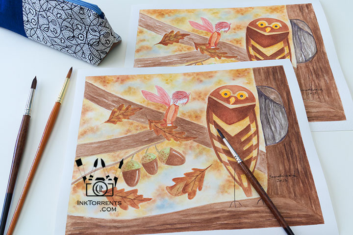
I am a very happy girl whenever I get to deep dive. Not only did I figure out the geometry of a triangular pencil case and how to draft the pattern for it, I also pulled out my sewing machine and promptly stitched one afterwards. For another Outside the Lines art supply review, I painted this same picture twice, so I could compare the behavior of paint on both cold press and hot press watercolor paper first-hand. I am excited to share more about sewing and painting along with another set of black and white everyday photos.
The Unexpected
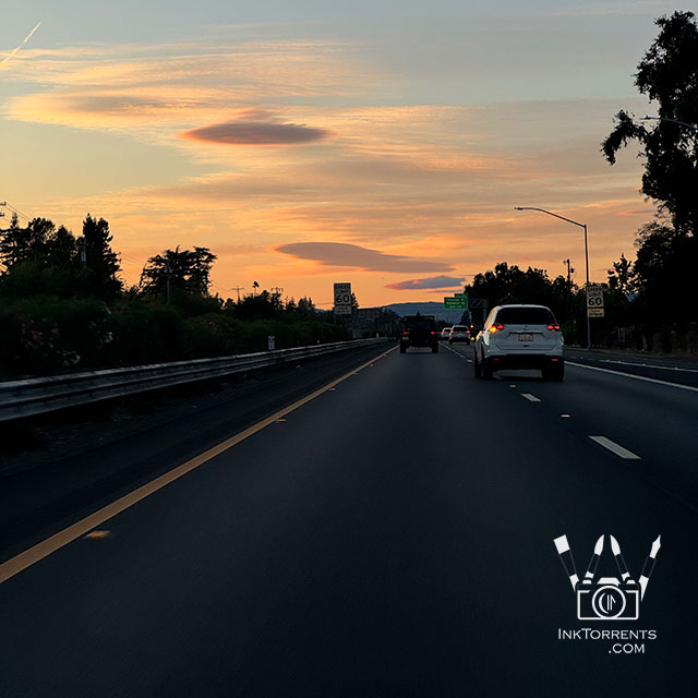
Coming back from the bookstore, we saw a bank of lenticular clouds. It is not a common occurrence here at all. That really surprised me. I have only ever seen them at the Eastern Sierra region.
Linking up with Skywatch Friday.
Cracking the Code of The Pencil Case
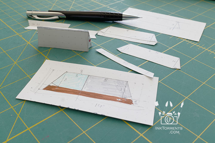
Back at home, I really wanted to sew a pencil case for myself. It would have been easy to follow one of the myriad patterns out there, but I wanted to understand the 3-D geometry of a triangular pencil case so I could draft a pattern for any size. After drawing and playing with the lines and angles on scrap paper and building a little model pyramid from the mini pattern cut-out, I had my math for the project.
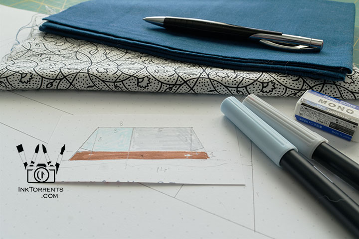
Fabric pulled and pattern drawn out, I set about sewing.
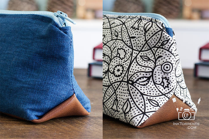
I followed a sewing tutorial for the triangle box corner. I really, really did not like the little “pockets” it originally created in the left photo. So off I went to stare at the stitched pieces until I came up with an idea. Since this was at midnight, I grudgingly decided to go to bed. Next day, after a couple of tries, I found the correct seam line that avoids the “pockets”. Now my little case looks like the right picture. I am just glad I did not tear any fabric while continuously undoing the stitches until I got what I wanted.
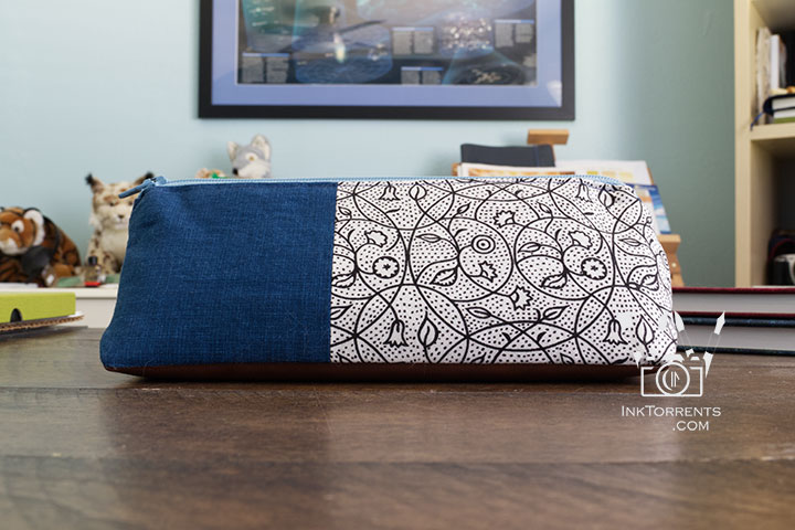
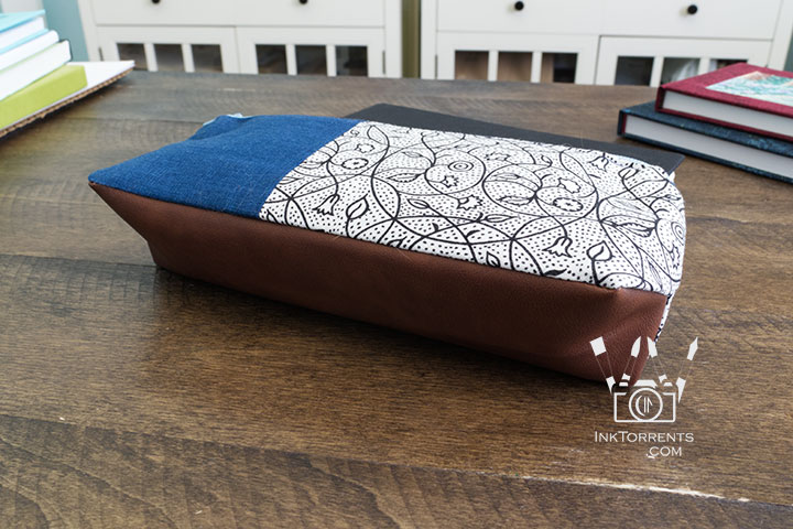
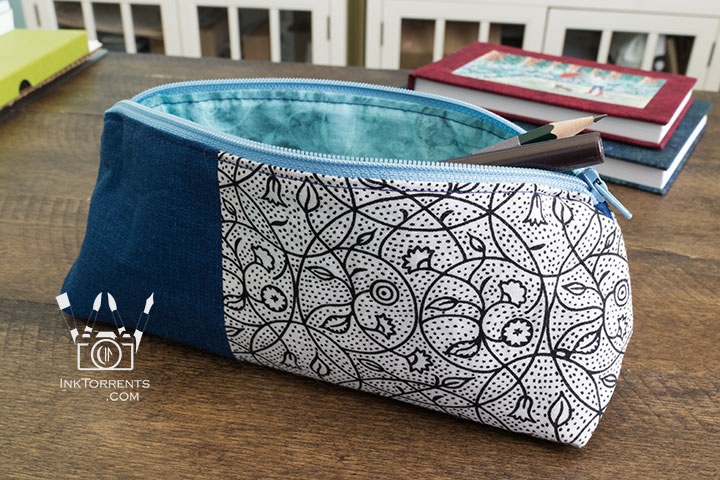
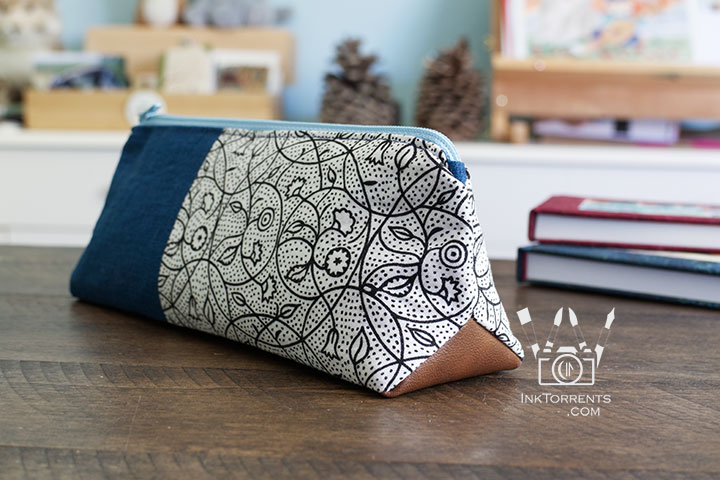
I used a piece of faux leather for the bottom, and was happy to see that it stitched up just like fabric without even changing my needle. I love the bi-color case.
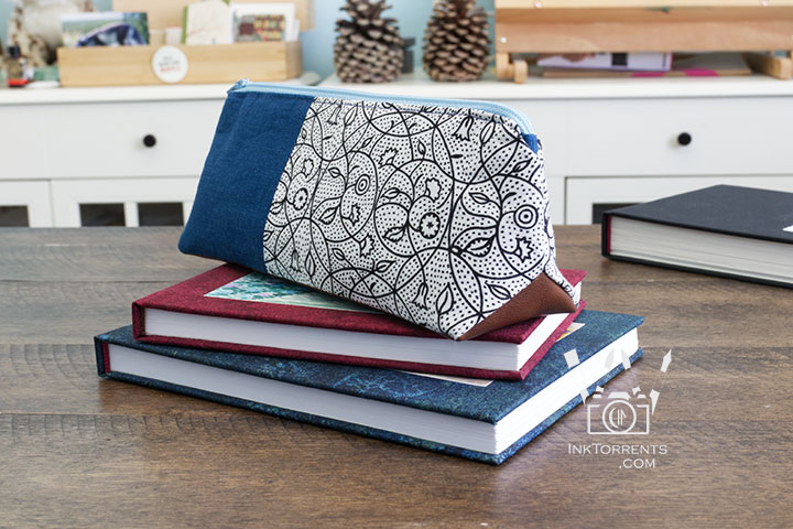
Now I am all set with my new sketchbooks and my brand new pencil case. One note – the case tapers toward the top, so longer pens and pencils need to sit at the bottom. Otherwise it holds my plethora of pens and pencils easily. It measures 8.0″ x 3.0″ with a depth of 2.0″. Next time I will make it a little longer for my Tombow markers.
Life in Black & White – Simple 365 Set 16
I took black and white photos over a year. Time had rolled into October during this set. That is the time I can finally head outside after spending long months at home.
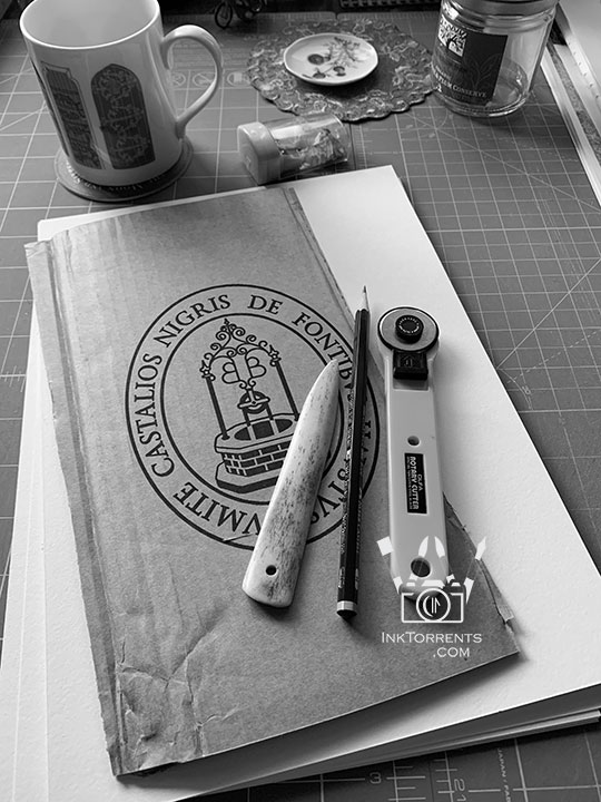
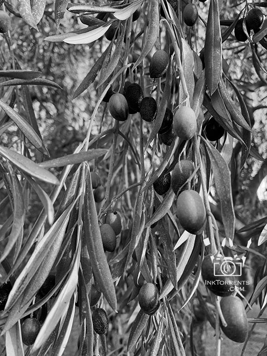
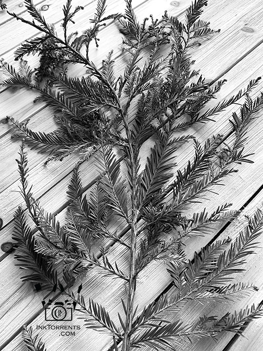
That year though, it was different. So all the photos are from around the home. Things that remind me to be happy. Greens from the garden, art supplies (of course), little notes and cards that bookshops sent me with my orders, and so on. I was thankful about those little things.
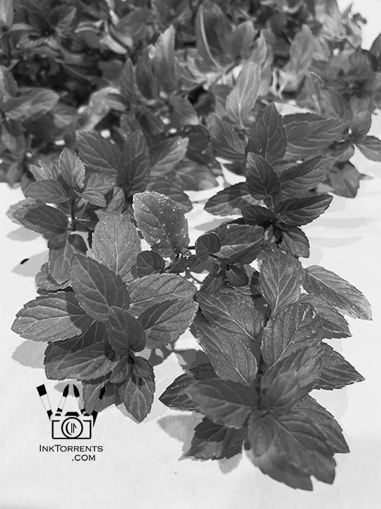
I dabble with making fruit and herbal wine, so last of the mint got collected for a new batch of wine.
Please Click on the image thumbnails to see the photos.
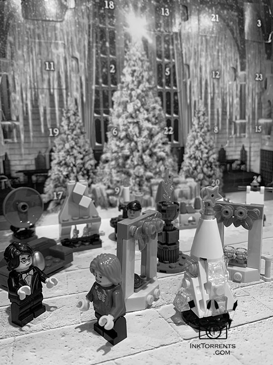
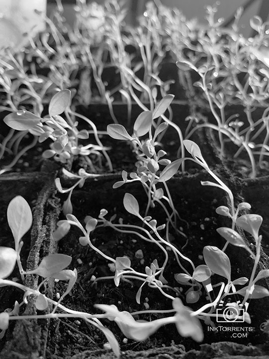
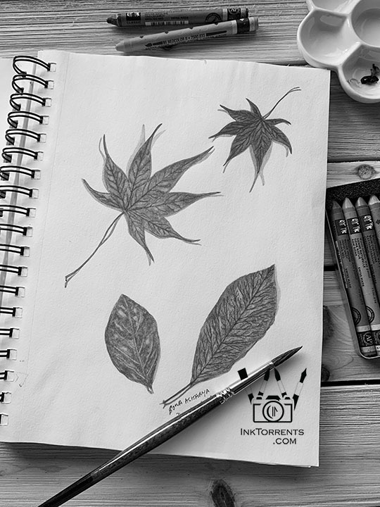
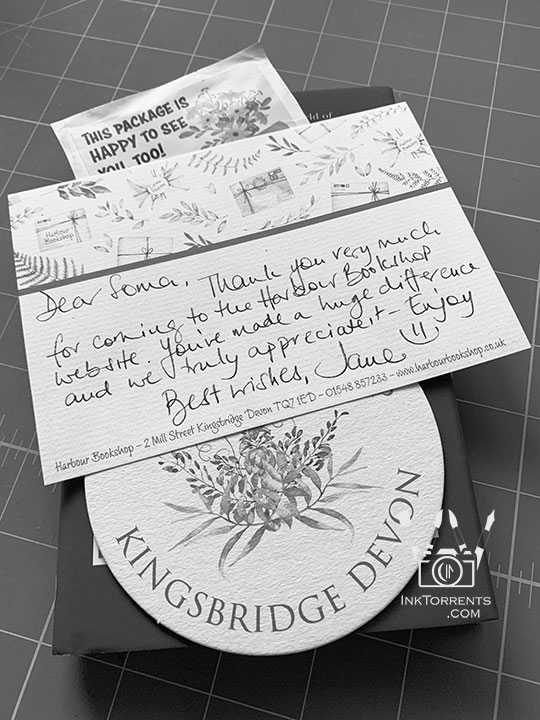
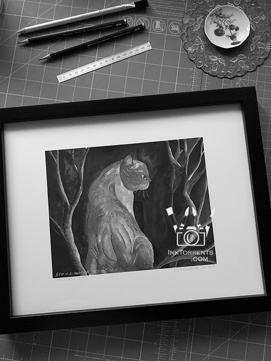
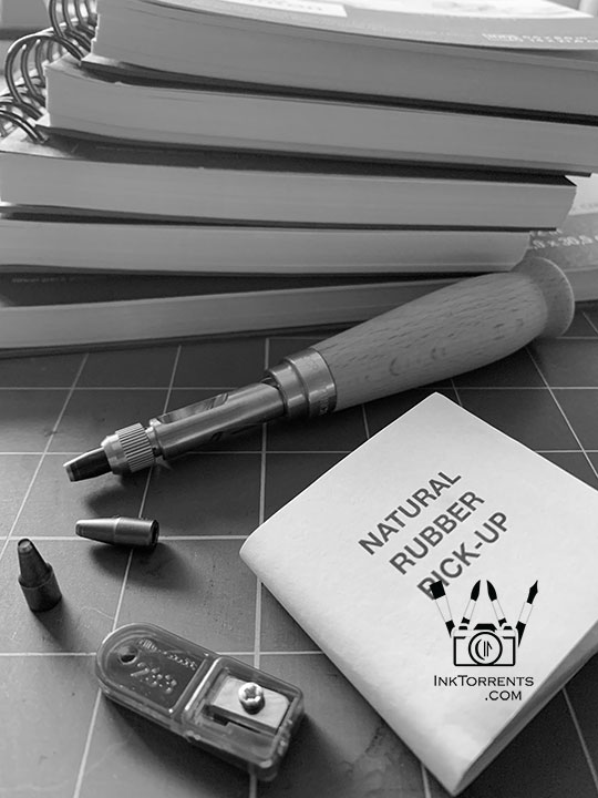
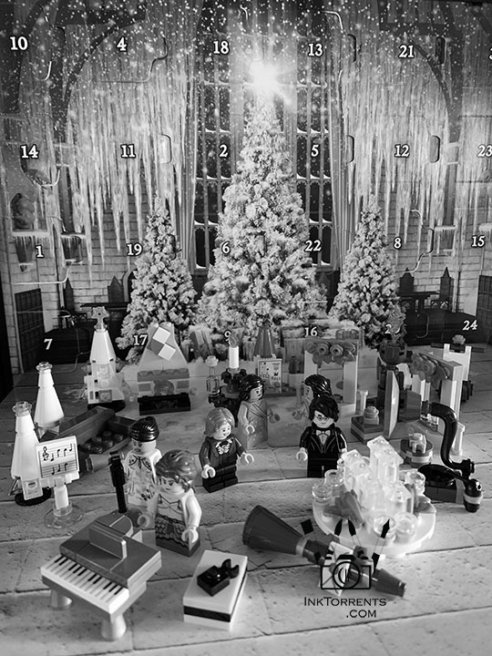
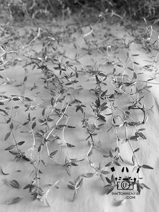
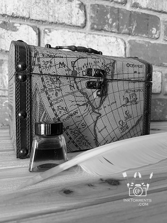
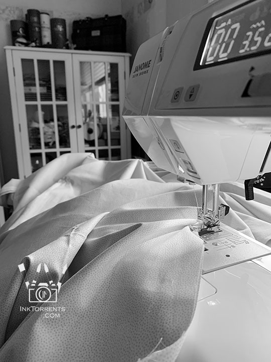
I created a page with all the previously shared photos from Simple365. That way I can relive my journey through the year via black and white photos, like in an old photo album.
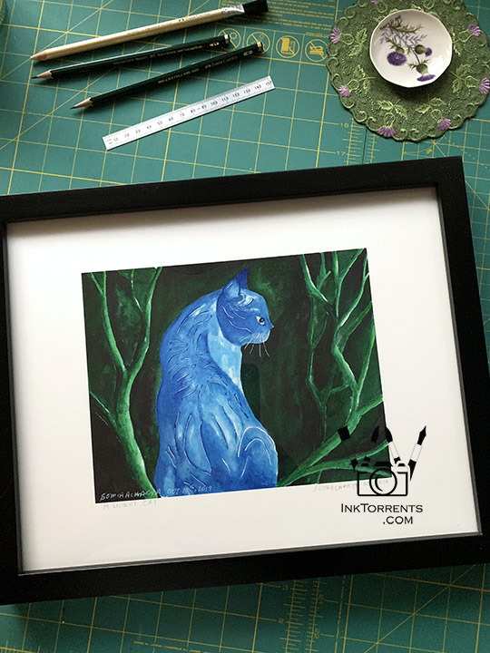
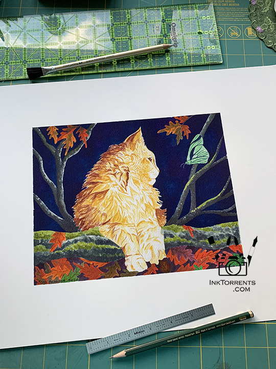
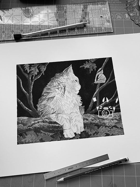
These two are stylized paintings of my cats. My vet contacted me for a set of prints of these paintings that he wanted for his collection. In these photos I am preparing the prints for framing.
I really like the black and white versions of them. The contrast surprised me.
Outside The Lines
The Two Textures of Hot Press and Cold Press
Although I paint with almost everything under the sun, I am in love with watercolor. There are two kinds of watercolor papers – cold press (CP) and hot press (HP). The difference is mostly the texture, which makes the paper behave differently.
I mostly use the textured CP paper for my paintings. However, occasionally I reach for the smoother HP paper. I often found myself wondering: what is the real difference?!
So I set out to paint the same painting twice, side by side. Same colors applied the same exact way.
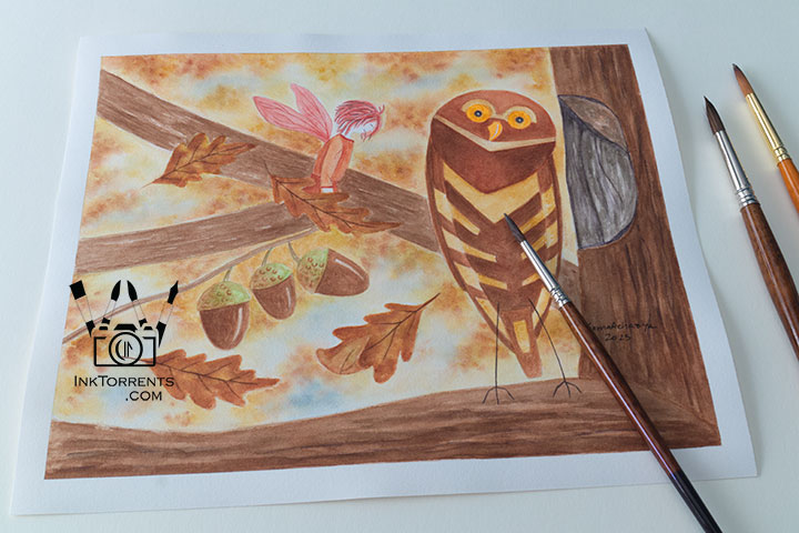
Painted on hot press paper
Because of the smoother surface, HP paper tends to be lighter and gentler. This paper can’t be overworked like CP paper. So it needs a more sure hand.
Paint sits more uniformly on the smooth surface, so it looks more even.
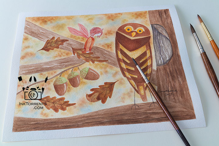
Painted on cold press paper
I work on very wet paper and I continuously layer my paints until I get the color intensity I’m looking for. CP paper is much hardier, so it is a much better choice for me.
The texture of the CP paper is a bit temperamental with paint. The ridges and valleys hold on to paint unevenly, resulting in a more unexpected yet dramatic look.
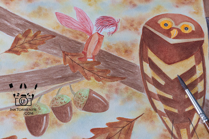
I got much sharper lines and edges on the HP paper. Because of the smoother surface, the paint does look a bit more brilliant. Although, I hasten to add, you really have to try to see the difference.
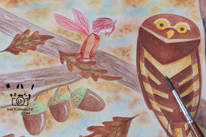
CP paper creates a much softer edge. The texture of the paper makes the colors look a bit mellower.
When I painted the face of the fairy, I had to be super mindful to avoid the wobble of the brush as it went over the rougher surface of the CP paper.
My Takeaway
CP paper – Hard-wearing, softer outlines, and temperamental with paint. The result is not always very predictable, but that is the nature of watercolor anyway.
HP paper – Gentler, sharper outlines, more predictable paint dispersion. I found it provides a bit more control. It also stays wet longer, even in our dry California climate.
I used Arches 100% cotton paper for these paintings.
Owl and The Autumn Fairy – At The Hollow
A Little Story
All summer I wait for the Orion constellation to show up in the night sky. The idea of the owl and the fairy came from that. Each of the four fairies come to visit their owl friend when they wake up at the beginning of each season. Here, the Autumn Fairy is very happy to find her friend at the Hollow. First of many visits.
It will be a while before I can step outside comfortably without having to worry about breathing. I am looking forward to the first sighting of my perpetual sky friend.
Until next time,
-Soma
I am linking up with the linky parties on my Links page. Please pay a visit to some of them. Hosts of linky parties – please grab a photo of your choice for your party. Thank you for hosting!

54 thoughts on “Little Stories – Threads, Tones, and Textures”
Linda Primmer August 30, 2026 at 08:46
Love the artwork. The pencil case is so nice. The owl is calling my name since we recently had owls on our patio. I am happy to feature your lovely work at Love Your Creativity.
Peabea August 26, 2026 at 21:56
Always fun when a plan comes together. I like how your pencil case turned out.
Rena August 25, 2026 at 20:35
I enjoyed seeing what you’ve been up to. Thanks so much for joining the link-up this week!
Rena
Jennifer @ Inquiring Quilter August 24, 2026 at 08:16
Your owl paintings are lovely! I really appreciated the discussion of the difference in the papers. Your cat paintings are so wonderful–in black and white or color! You’re so talented to have figured out that pencil case. It sure turned out pretty. Thanks for sharing on my weekly show and tell, Wednesday Wait Loss.
Rambling woods August 22, 2026 at 15:21
Your photo of the orange tabby cat made me think of my two orange tabby cat brothers that we lost. But they did live to 21 and 22 years old respectively. You have so many different kinds of talents and artistic expression.
Amy Johnson August 22, 2026 at 04:37
Your pencil case is incredible. You are such a gifted seamstress. The owl painting is so cute. I love anything with owls on it. Your cat paintings are amazing! And that sky photo is incredible!
Sarah MumofThree World August 21, 2026 at 21:39
Well done on working out how to make the pencil case as you wanted it. It looks great!
How lovely that the vet wanted prints of your cat paintings.
Photo Cache August 21, 2026 at 08:16
Your sky shot/drive by shot image is superbly captured. Love it.
Worth a Thousand Words
Michelle August 20, 2026 at 15:06
I like the pencil case and the cat print is gorgeous! Thank you for linking up.
Peter B. August 20, 2026 at 13:17
I love those lenticular clouds!
Alan August 20, 2026 at 11:41
Not only are you talented, you are persistent.
Jim, Sydney, Australia August 20, 2026 at 11:29
Great
Juliet (Crafty Green Poet) August 17, 2026 at 08:40
Your pencil case is beautiful, very smart.
I love the owl and cats too. It’s really interesting to see the difference between the two types of paper in the owl painting.
Lydia C. Lee August 16, 2026 at 15:13
Gorgeous as always #WeeklyWonder
kwarkito August 16, 2026 at 01:24
J’aime beaucoup cette chouette. Elle est vraiment très belle
Jayne @ Sticky Mud and Belly Laughs August 15, 2026 at 05:18
I love the pencil case, Soma. The fabric and faux leather look fab together. It was really interesting seeing the difference between the two papers too.
And of course, your owl and the autumn fairy are gorgeous! xx
veronica lee August 15, 2026 at 02:52
I love seeing how much difference the paper makes to the finished work. And your little pencil case turned out beautifully! The owl and fairy are gorgeous too. You’ve definitely got a lot of patience!
an artist reflects August 14, 2026 at 15:33
Love the owl and the little angel/fairy ~ so sweet ~ and the kitty is awesome and lovely pencil case ~ You are so talented ~ Hugs ^_^
Thanks for commenting on my blog too ^_^
Christine August 14, 2026 at 12:41
Lovely
Alycia Quiltygirl August 14, 2026 at 08:17
Super cute pencil case. Those corners are elusive – but you found the secret! it looks great!!
handmade by amalia August 14, 2026 at 07:30
I enjoyed your deep dive and following your process. That owl is adorable.
Amalia
xo
TerryK August 14, 2026 at 06:02
Your pencil case rocks! I appreciated your take on the CP and HP water color paper. I play with CP; but, wondered what the difference was!
Gillena August 14, 2026 at 02:58
Some nice paintings. I did not know of those 2 types watercolour paper
Happy Friday
Thanks for linking to AFFF today
much love
Sallie August 12, 2026 at 13:07
Thank you Soma for the beauty and smiles and for the reminder to take more pictures — the one creative thing I can even begin to do! I love the story of the owl .
Sandee @ Comedy Plus August 12, 2026 at 08:50
You’re most talented. Love the owl and the kitties. Beautiful.
Thank you for joining the Wordless Wednesday Blog Hop.
Have a fabulous day and rest of the week. ♥
Carol on The Lake August 10, 2026 at 05:56
I love the owl and the little fairy. I have a thing for owls and the precious fairy makes it all magical! #MMBC
Kim Carberry August 10, 2026 at 03:04
That pencil case looks fantastic, it sounds like a lot of work went into getting is just right.
The black and white photos are beautiful and so are the paintings of the cats.
Lisa | Handmade in Israel August 9, 2026 at 23:24
Lovely post, Soma! I really enjoyed seeing how differently the papers respond. Your owl and fairy painting is beautiful. The pencil case is gorgeous too, especially after all your persistence in getting those corners just right.
Linda August 9, 2026 at 00:04
Beautiful paintings and lovely pencil case.
Lavender August 8, 2026 at 14:08
Of course I love the owl and you gave him such a pensive expression! I got in the mood and made little bags. I’m always surprised when they come out right! lol Sweet hugs, Diane
Linda August 8, 2026 at 13:57
Your pencil case is a hit. Lovely paintings too.
Maria August 8, 2026 at 10:27
Everything you create is a work of art. I like the sharpness of the HP at least in this fairy drawing, it suits the subject. Very beautiful.
Brenda @ Songbird Designs August 8, 2026 at 08:54
Very interesting post. I loved seeing the difference between the HP and CP papers. And I love how both versions turned out. I really love your pencil case too! Like you, I’m so ready for that fall fairy to make a visit! I always look for yellow butterflies. My Mama always said yellow butterflies are a sign of fall, and I always remember her fondly when I see one! Take good care of yourself in this heat!
jeanie August 8, 2026 at 08:23
Well, first of all, I love the paintings. Just love them. The owl has such character and there is a lot of visual texture here — the lightness of the fairy, the more precise owl, the scrumbly background. I tend to work on cold press but I really liked the idea of this experiment and think I may have to try the same at some point.
Eileen August 8, 2026 at 01:29
Hello Soma,
I love the owl and fairy painting and story. Your pencil case looks great, well done.
Your B&W images are beautiful, a great collection.
Your art work is amazing!
Thank you for linking up and sharing your post. Take care, have a happy weekend.
Adam August 8, 2026 at 00:05
Superb artwork. You have a real talent.
Dixie August 7, 2026 at 21:37
Beautiful work on your pencil case.
Love your kitty paintings.
Lovely owl and fairy painting and story as well, Soma.
Christine August 7, 2026 at 18:57
Lovely art and photos
Bleubeard and Elizabeth August 7, 2026 at 14:47
I love the pencil holder and the owls. But the cat was my favorite.
Cat August 7, 2026 at 13:58
The pencil case looks perfect. It’s amazing how determined you can get if you want to get something looking just right, I know that from beading. Then when it works, that feels so good.
The fairy and the owl – I want to know what they were talking about!
Nicole/DVArtist August 7, 2026 at 11:55
A lovely post. You are so very talented. That pencil case is brilliant and I love how you figured out the little pockets. I like cold press paper but I do have some hot press. I probably should use it. Sept and Oct are usually very nice here. Thank you for sharing all of your talents and beautiful art with FFO and have a wonderful weekend.
Conniecrafter August 7, 2026 at 10:42
Yes we have had days here that were very hard for me to breathe when I had to walk far like into a store or do yard work.
Wow I never would have figured out that case, but then again I didn’t do well in math class either, love the touch of the faux leather with it too.
I love your second cat picture, so much reminds me of my cat :)
I have tried both types of water color papers for my cards and still don’t know which I like better, maybe because I am not good at water coloring.
Hope you will be able to venture out soon!
Erika August 7, 2026 at 05:35
That’s a fun idea to paint the exact same picture on HP and CP. I use both also, but since I do more bookmaking than picture painting, I tend to go with HP as it takes a rubber stamp image better. But it is fun to play and discover isn’t it? And I really like he faux leather bottom of your pencil case. I used to make a lot of clothes when I was younger, now for some reason I am not really interested in it, but I learned a lot about creating pieces and patterns. Your pencil case came out great! I think it’s always fun to see what art and style each person like to do, and how they do it. It’s very inspiring. Have a wonderful weekend. hugs-Erika
Arnoldo Romero August 7, 2026 at 05:22
I always travel with a set of art supplies, so I really like the pencil bag you made. I also love the graphic feel of your owl and fairy painting. Happy FFO!
tomthebackroadstraveller August 7, 2026 at 04:58
…another tasteful post!
Maria August 7, 2026 at 04:12
Beautiful artwork! I love your pencil cases! Stunning! I love black and white photos, they make my eyes focus on texture a lot. Have a lovely weekend and beautiful post! You are truly so so talented! I love your watercolour and owls are so beautiful.
Mary August 6, 2026 at 16:21
Your pencil case turned out great, Soma. Your persistence paid off and the design looks detailed and complicated with those angles. Reading your comparisons between CP and HP makes me wish I could watercolor. It sounds fascinating and I could actually imagine the difference as I read about it. While I grudgingly let go of these summer months, I do hope for a lovely fall and winter for you…..just not too cold!
Joanne August 6, 2026 at 11:05
Your pencil case is lovely! I don’t know that I’ve ever paid attention to HP versus CP papers when using watercolors… I’m going to have to experiment myself.
Bill August 6, 2026 at 10:52
I hope you are better, the last reply I had sounded as you had a rough time. We are suffering here with a heat wave and had some seriously hot days in the high 30c it seems to be cooling a bit now but still going up and down.
Your work is amazing and I do like how you finished the corners, I would be doing the same thing if it was me.
Here is another blog for you to look at there is a stunning Norman font in the church I have shown it at the end
Sisie August 6, 2026 at 10:35
I love seeing your thoughts develop and merge with your artistic talents , Soma !
Your cat photos are amazing !!
And what a gorgeous pencil case you have designed !!!
Karen Goad August 6, 2026 at 09:32
I love the pencil case without the “pockets” on the end I never really like those either. And I love the cat!
Debra She Who Seeks August 6, 2026 at 08:19
Your pencil case is gorgeous! What a pleasure it must be to use.
Linda at Texas Quilt Gal August 6, 2026 at 06:35
Your pencil case is very pretty. You were so patient in the process of working out the unwanted “pockets”! I will take your word for the differences between HP and CP – lol – my untrained eye is, well, untrained. ;) I think you and I are both looking forward to that first full breath of brisk cold air. I cannot explain it to my husband, who loves heat. All I can say is it feels wonderful to my throat and all the way to my lungs. Wishing you a quick summer and slow winter.
Char | ChronicallyHopeful.com August 6, 2026 at 02:41
I really like the pencil case, it turned out so lovely with the combination of those fabrics too.
I’ve been using hot pressed a lot over the years, but lately I have fallen in love with cold pressed paper. The pigments just sit better on it, in my opinion. I will still use both, or maybe switch to mixed media paper once my HP is finished – for line drawing, etc. But for liquid mediums, the CP is definitely superior.
I’m always amazed at how making a photo black and white just gives it such a different vibe. I love black and white photos!