Little Stories – Threads, Tones, and Textures

Owl and The Autumn Fairy watercolor painting, fall colors, compared on hotpress vs coldpress paper by InkTorrents Graphics


I am a very happy girl whenever I get to deep dive.  Not only did I figure out the geometry of a triangular pencil case and how to draft the pattern for it, I also pulled out my sewing machine and promptly stitched one afterwards.  For another Outside the Lines art supply review, I painted this same picture twice, so I could compare the behavior of paint on both cold press and hot press watercolor paper first-hand.  I am excited to share more about sewing and painting along with another set of black and white everyday photos.


The Unexpected
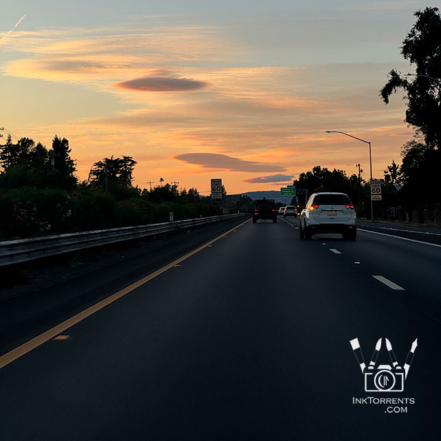


Coming back from the bookstore, we saw a bank of lenticular clouds.  It is not a common occurrence here at all.    That really surprised me.  I have only ever seen them at the Eastern Sierra region. 
Linking up with Skywatch Friday.


 Cracking the Code of The Pencil Case


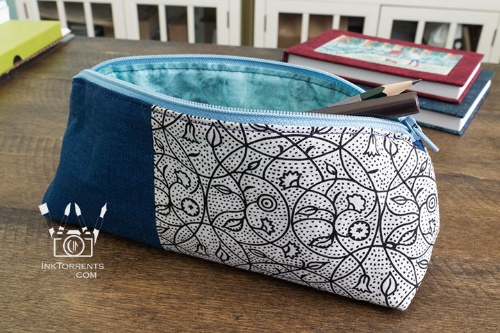
Handmade triangular zippered pencil case in printed cotton and faux leather, self-drafted pattern, by InkTorrents Graphics


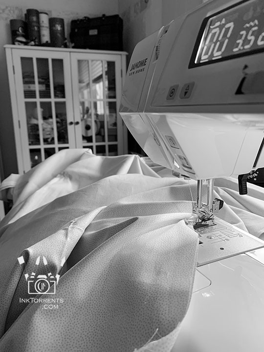
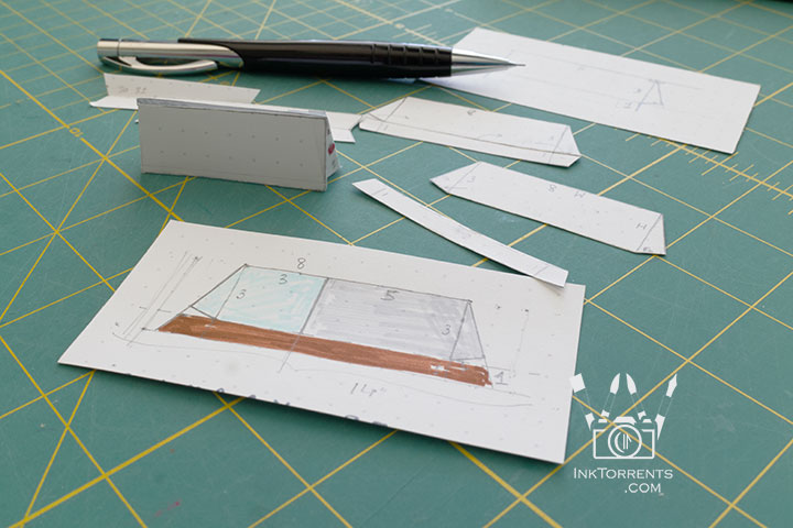
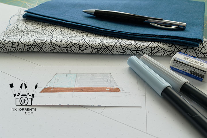
Back at home, I really wanted to sew a pencil case for myself.  It would have been easy to follow one of the myriad patterns out there, but I wanted to understand the 3-D geometry of a triangular pencil case so I could draft a pattern for any size.  After drawing and playing with the lines and angles on scrap paper and building a little model pyramid from the mini pattern cut-out, I had my math for the project.


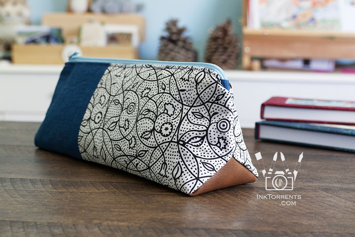
Handmade triangular zippered pencil case in printed cotton and faux leather, self-drafted pattern, by InkTorrents Graphics


Fabric pulled and pattern drawn out, I set about sewing.


Close-up of the triangular box corner on this triangular pencil case, by InkTorrents Graphics


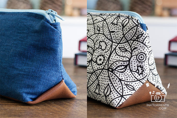
I followed a sewing tutorial for the triangle box corner.  I really, really did not like the little “pockets” it originally created in the left photo.  So off I went to stare at the stitched pieces until I came up with an idea.  Since this was at midnight, I grudgingly decided to go to bed.  Next day, after a couple of tries, I found the correct seam line that avoids the “pockets”.  Now my little case looks like the right picture.  I am just glad I did not tear any fabric while continuously undoing the stitches until I got what I wanted.
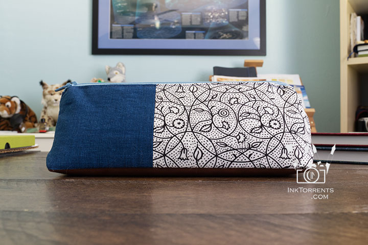
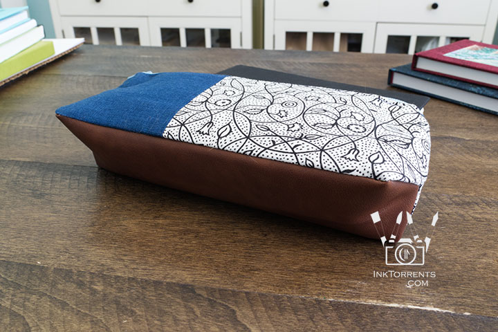


I used a piece of faux leather for the bottom, and was happy to see that it stitched up just like fabric without even changing my needle.  I love the bi-color case.
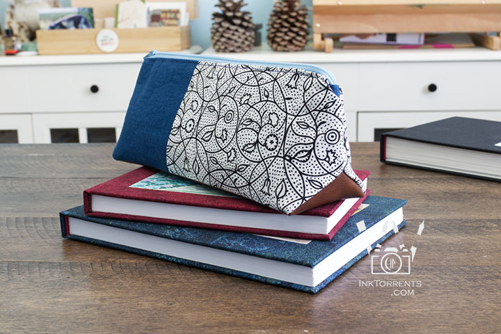


Handmade triangular zippered pencil case in printed cotton and faux leather, self-drafted pattern by InkTorrents Graphics


Now I am all set with my new sketchbooks and my brand new pencil case.  One note – the case tapers toward the top, so longer pens and pencils need to sit at the bottom.  Otherwise it holds my plethora of pens and pencils easily.  It measures 8.0″ x 3.0″ with a depth of 2.0″.  Next time I will make it a little longer for my Tombow markers.


Life in Black & White – Simple 365 Set 16


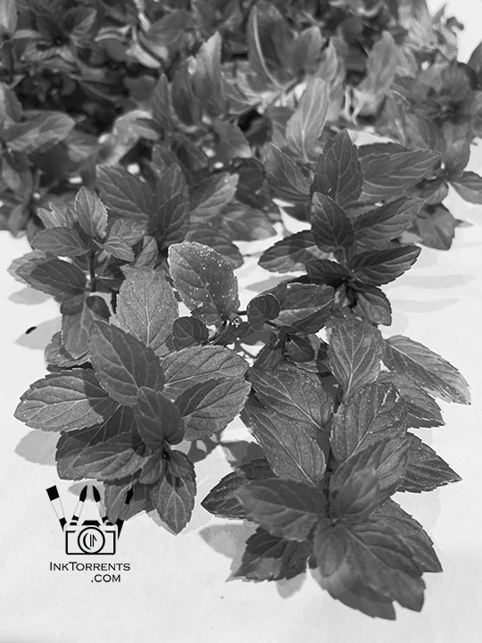
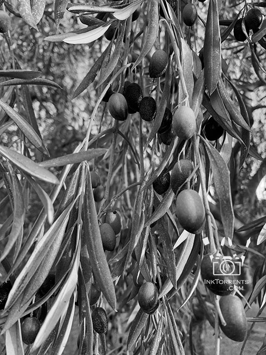
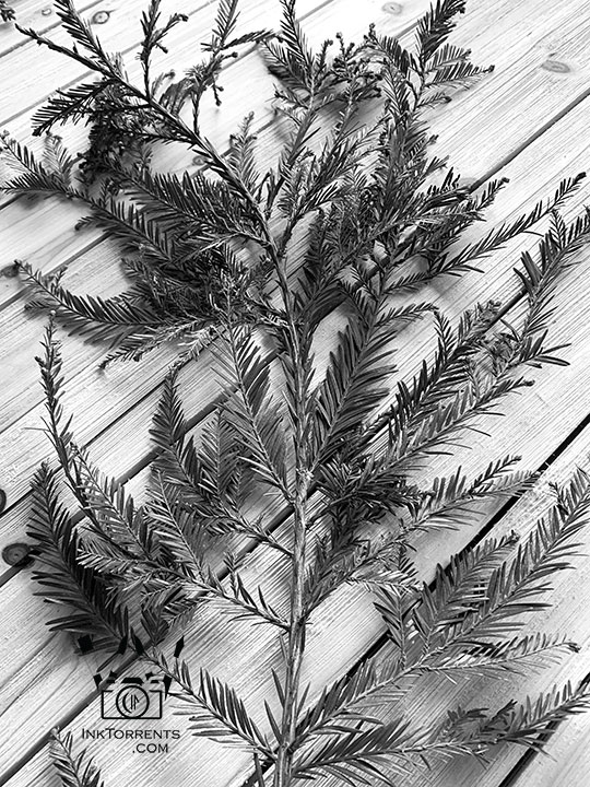
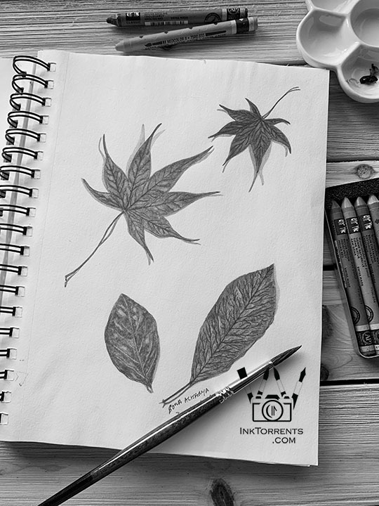
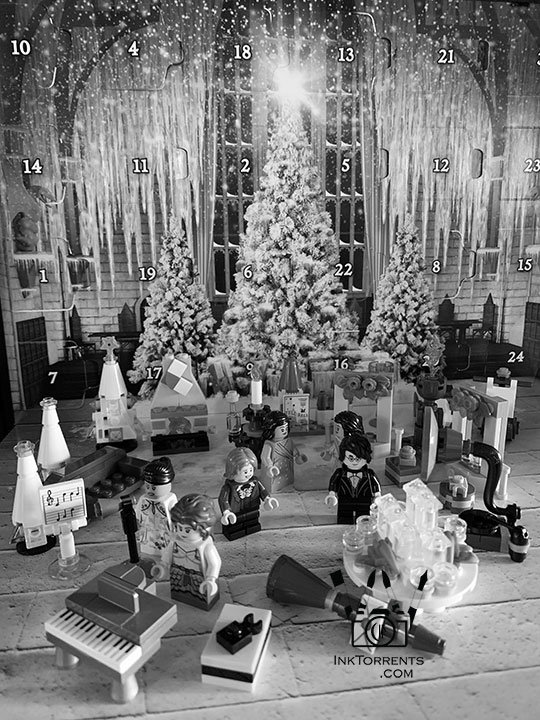
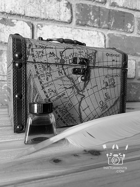
I took black and white photos over a year.  Time had rolled into October during this set.  That is the time I can finally head outside after spending long months at home. 

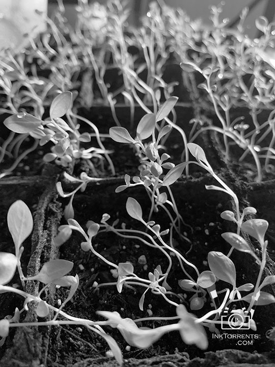
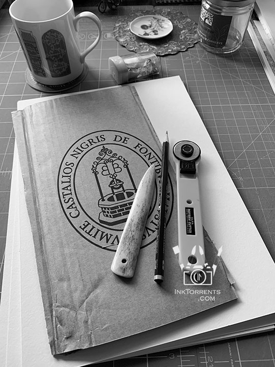
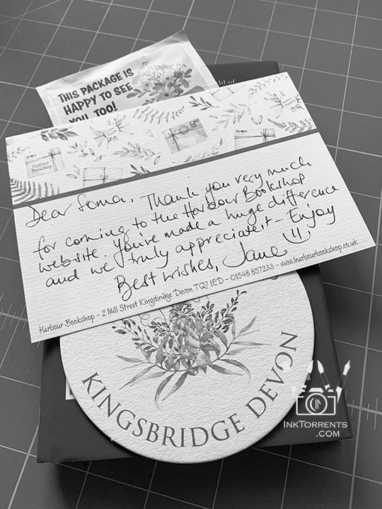
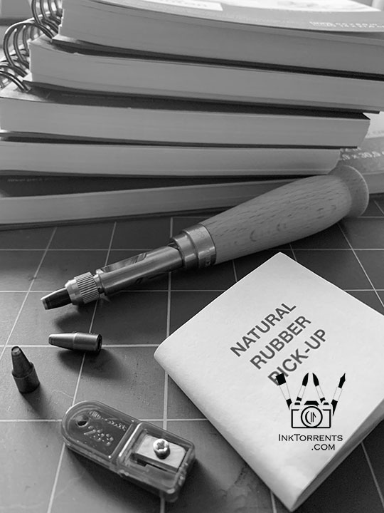
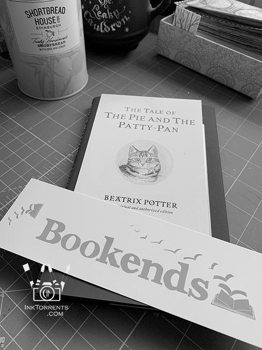
That year though, it was different.  So all the photos are from around the home.  Things that remind me to be happy.  Greens from the garden, art supplies (of course), little notes and cards that bookshops sent me with my orders, and so on.  I was thankful about those little things.

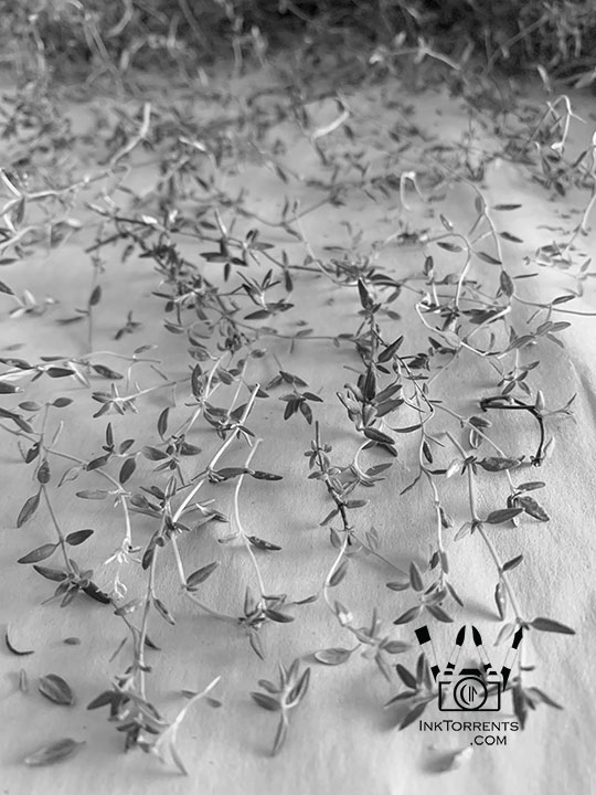
I dabble with making fruit and herbal wine, so last of the mint got collected for a new batch of wine.


Please Click on the image thumbnails to see the photos.
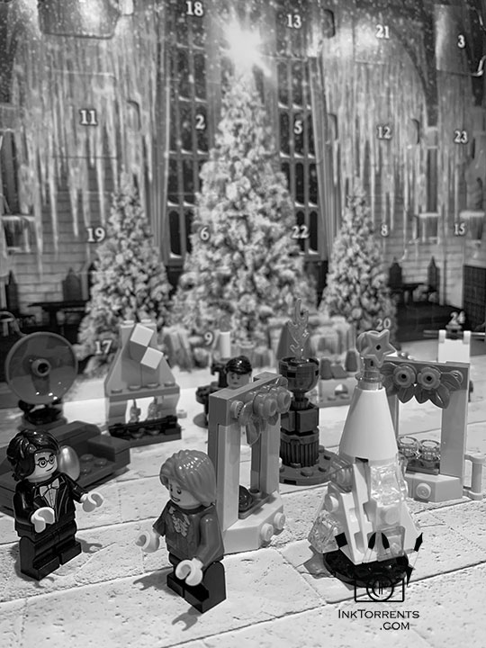


I created a page with all the previously shared photos from Simple365.  That way I can relive my journey through the year via black and white photos, like in an old photo album.
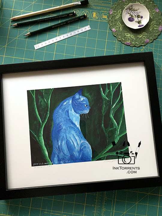
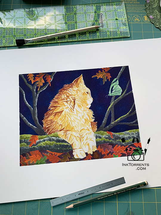


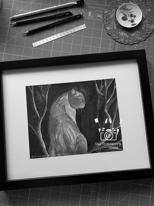
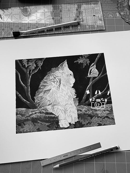
These two are stylized paintings of my cats. My vet contacted me for a set of prints of these paintings that he wanted for his collection. In these photos I am preparing the prints for framing.

I really like the black and white versions of them.  The contrast surprised me.


Outside The Lines

The Two Textures of Hot Press and Cold Press


Although I paint with almost everything under the sun, I am in love with watercolor.   There are two kinds of watercolor papers – cold press (CP) and hot press (HP).   The difference is mostly the texture, which makes the paper behave differently. 

I mostly use the textured CP paper for my paintings.  However, occasionally I reach for the smoother HP paper.  I often found myself wondering: what is the real difference?!

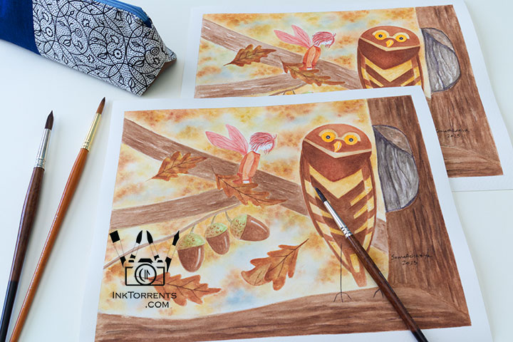
So I set out to paint the same painting twice, side by side.  Same colors applied the same exact way.
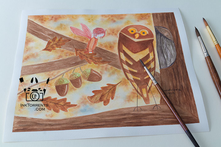


Owl and The Autumn Fairy watercolor painting in fall colors on hotpress paper, smooth crisp detail, by InkTorrents Graphics


Painted on hot press paper


Because of the smoother surface, HP paper tends to be lighter and gentler.   This paper can’t be overworked like CP paper.  So it needs a more sure hand.  

Paint sits more uniformly on the smooth surface, so it looks more even.
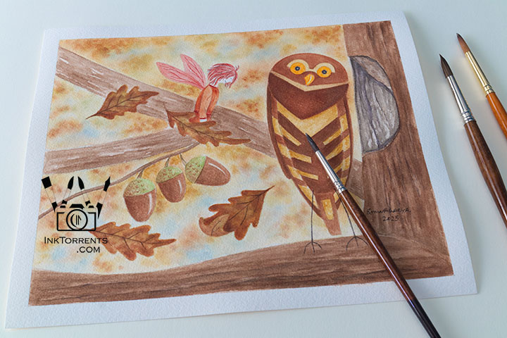


Owl and The Autumn Fairy watercolor painting in fall colors on coldpress paper, soft textured brushwork, by InkTorrents Graphics


Painted on cold press paper


I work on very wet paper and I continuously layer my paints until I get the color intensity I’m looking for.  CP paper is much hardier, so it is a much better choice for me.

The texture of the CP paper is a bit temperamental with paint.  The ridges and valleys hold on to paint unevenly, resulting in a more unexpected yet dramatic look.
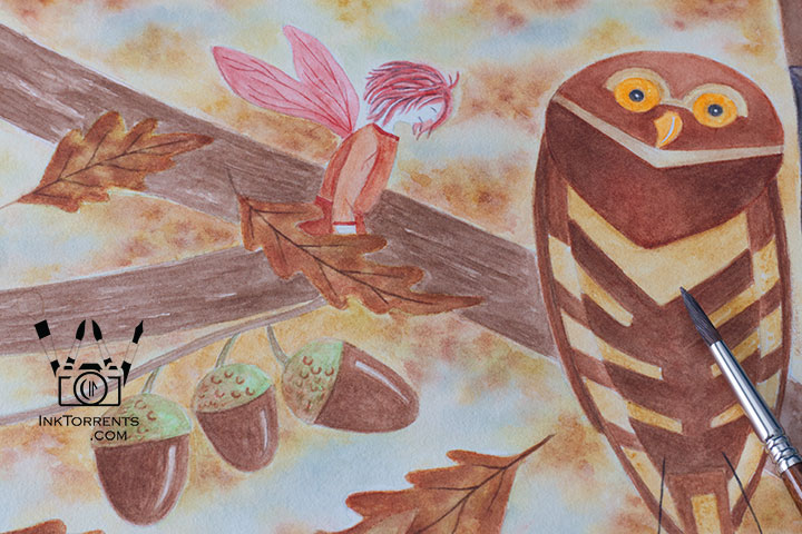


Owl and The Autumn Fairy watercolor painting in fall colors on hotpress paper, smooth crisp detail, by InkTorrents Graphics


I got much sharper lines and edges on the HP paper.  Because of the smoother surface, the paint does look a bit more brilliant.  Although, I hasten to add, you really have to try to see the difference. 
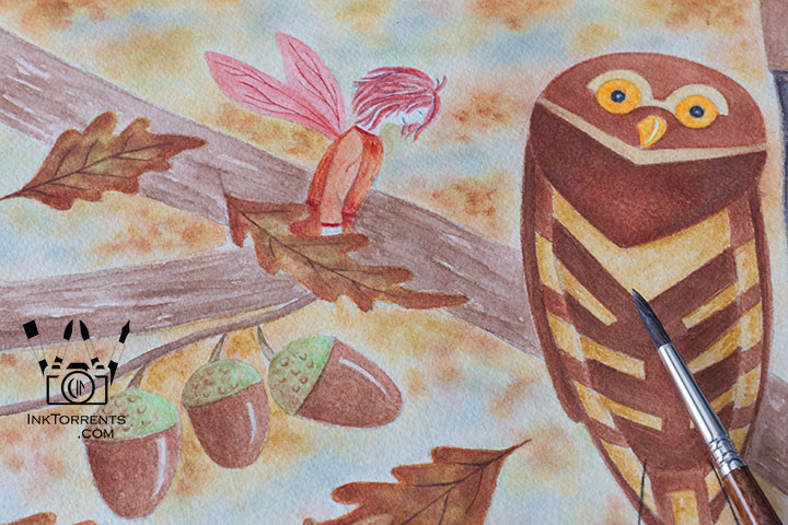


Owl and The Autumn Fairy watercolor painting in fall colors on coldpress paper, soft textured brushwork, by InkTorrents Graphics


CP paper creates a much softer edge.  The texture of the paper makes the colors look a bit mellower.

When I painted the face of the fairy, I had to be super mindful to avoid the wobble of the brush as it went over the rougher surface of the CP paper.


My Takeaway


CP paper – Hard-wearing, softer outlines, and temperamental with paint.  The result is not always very predictable, but that is the nature of watercolor anyway.
HP paper – Gentler, sharper outlines, more predictable paint dispersion. I found it provides a bit more control.  It also stays wet longer, even in our dry California climate.

I used Arches 100% cotton paper for these paintings.


Owl and The Autumn Fairy – At The Hollow

A Little Story


Owl and The Autumn Fairy watercolor painting, fall colors, compared on hotpress vs coldpress paper by InkTorrents Graphics


All summer I wait for the Orion constellation to show up in the night sky.  The idea of the owl and the fairy came from that.  Each of the four fairies come to visit their owl friend when they wake up at the beginning of each season.  Here, the Autumn Fairy is very happy to find her friend at the Hollow.  First of many visits.

It will be a while before I can step outside comfortably without having to worry about breathing.  I am looking forward to the first sighting of my perpetual sky friend.

Until next time,
-Soma


I am linking up with the linky parties on my Links page.  Please pay a visit to some of them.  Hosts of linky parties – please grab a photo of your choice for your party.  Thank you for hosting!


Leave a comment
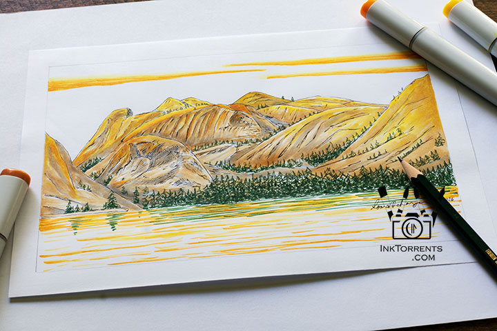
 

Alcohol marker painting of Tenaya Lake at Yosemite Tioga Pass — Copic marker tutorial by InkTorrents Graphics

Painting Yosemite with Copic Markers

Copic alcohol marker painting of Tenaya Lake at Yosemite's Tioga Pass with color swatches by InkTorrents Graphics


There are familiar places in the forests and mountains of California that I love revisiting for a reset and recover.   I fell in love with the High Sierra mountains and Tioga Pass during my first visit many years ago.  It’s a place that slows me down and pushes me to work harder at the same time.  Recently, I made a marker painting from a lakeside drawing I did there.  Along with the painting, I also want to talk about swatch making, different papers for marker painting, and other accompanying tools that I use with markers on this Outside the Lines art supply review.


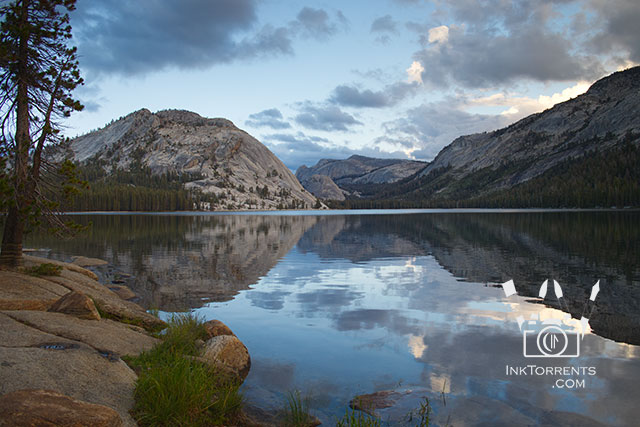
Tenaya Lake Tioga Pass Yosemite National Park photo by InkTorrents Graphics


Late afternoon at Tenaya Lake is one of my favourite places on Tioga Pass. Here time really slows down for me.  I have a favorite secluded spot behind a gigantic glacier erratic.  I tuck in behind that boulder with my camera and my sketchbook.  While I wait for the sky color to change for photography as the sun sets,  I try to make sense of the vast landscape in front of me on an 8″x5″ sheet of paper.  


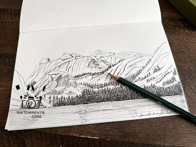
Sakura Micron Pen drawing of Tenaya Lake at Yosemite's Tioga Pass by InkTorrents Graphics


Flipping through my sketchbook for a different project, I came across this drawing.  In January, my husband got me a set of Copic markers for my birthday.  I got excited about painting this with my new markers.

Note:  You can use these tips for any alcohol markers, not just Copic.   I shy away from using generic paints.  Paint can be toxic if not properly bound, and I simply don’t trust the quality control of the pigments and carriers of generic brands.


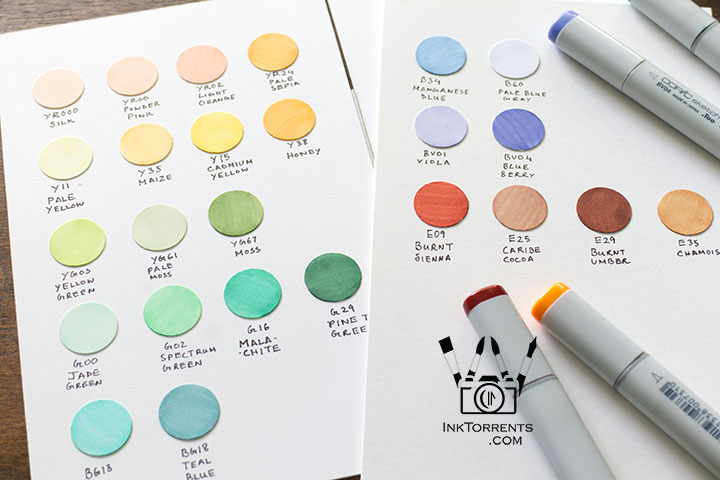
Copic alcohol marker color swatches by InkTorrents Graphics


I always swatch new colors.   Instead of guessing or trying out the shades all over again, I know exactly what colors I need to start a painting when I have my swatch cards at hand.


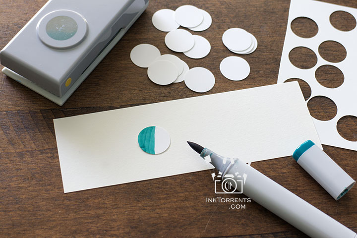
Copic alcohol marker color swatches by InkTorrents Graphics


I used a 3/4″ circle cutter to cut out the circles and painted the colors on them.  Afterwards, I affixed them on cardstock with glue sticks.   I could have painted on the paper directly, but I wanted have a little fun with the swatches.  The process of making swatches is very therapeutic for me.


Copic marker tutorial with pencils and pens to use with alcohol markers by InkTorrents Graphics


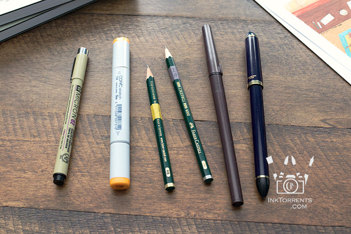
A few other tools I use along with the markers –

  • 02 and 005 micron pens – For black outlines and shading.
  • HB pencil – For the initial sketchbook drawing.  Creates soft lines on paper that are easy to erase.
  • 2H pencil – For copying the drawing over to the paper for painting.  Creates light markings that are barely visible under the painting.  

Pro-tip – A wide brush-pen or a flat-nib fude pen filled with permanent ink is nice to have when you have a large area to fill and a micron pen is too small.


Copic alcohol markers blending and bleeding comparison on different marker papers. by InkTorrents Graphics


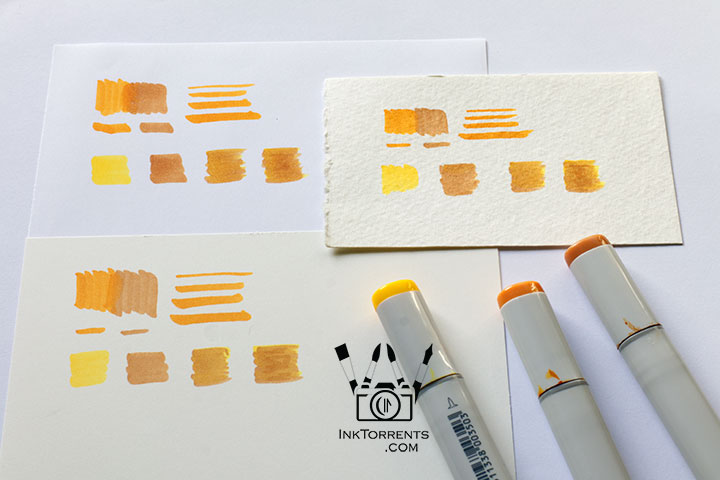
Paper plays a big part in painting –

Smooth marker paper blends colors best — the longer the alcohol stays wet, the smoother the blend. Paper tone matters too: white produces bright, luminous colors while cream produces warmer, more subdued tones.

Examples from the photos:

  • Top left (white) — Most luminous and best blending.  Detail lines didn’t show well.
  • Bottom left (cream) — Slightly muted colors, good blending.  Detail lines remained visible.
  • Top right (high-texture watercolor, cream) — Absorbed paint quickly, leaving lines.  No blending, but great for bold color-block styles.

Pro tip – Alcohol markers bleed through most paper, so place an extra sheet underneath to protect your surface.


Beginner Copic alcohol marker tutorial showing paper choice and color swatches by InkTorrents Graphics


Feel free to click on the image to pin it to your Pinterest board for future use.


Copic alcohol marker painting with earth tones by InkTorrents Graphics


Now that I have my swatches and a feel for the markers on paper, I am ready to paint.

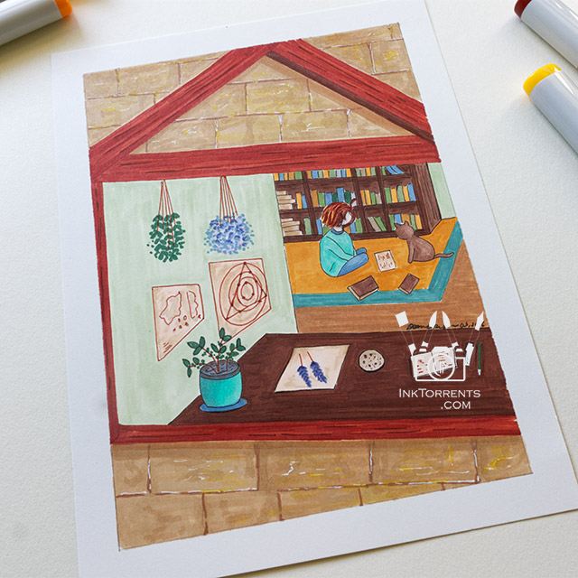
Pro-tip – Before you start, take a little time to think about the mood and style of your painting, then choose the paper accordingly.  Use the swatch card to pull out some of the main colors.  Keep a scrap paper handy to test color combinations.  These habits will make a big difference.  

I wanted to have a warm and cozy feeling for this  Girl and Her Cat painting, so I used the warmer-toned paper.  Just as expected, details, textures, and shadows remained visible on this paper.


Copic alcohol marker painting of Tenaya Lake at Yosemite's Tioga Pass with color swatches by InkTorrents Graphics


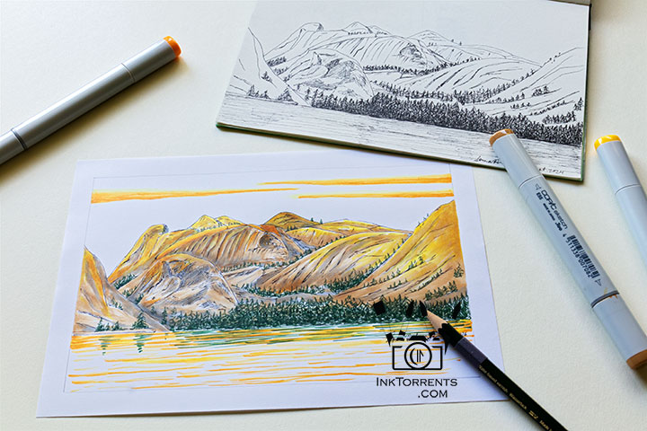
For this landscape painting, I wanted the colors to be very vibrant to depict the late afternoon sunlight on the rocks.  I used the white paper for this one.  

I started the painting by drawing the lines and shading marks with micron pens, similar to the drawing in my sketchbook.   Pro-tip – To prevent smudging, give the micron pen lines a few minutes to dry before painting on them.


Copic alcohol marker painting of Tenaya Lake at Yosemite's Tioga Pass with color swatches by InkTorrents Graphics


I started with the lightest yellow and earth tone, then layered the other colors slowly on top.  On this paper, layers of colors blended into each other, giving me a watercolor effect.

Painting this was a beautiful way to rekindle the memory of our last visit there.


A drawing of Girl and her cat by InkTorrents Graphics


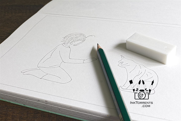
I just started a new drawing for my next marker painting.   I drew them a little closer than usual so the faces are more visible this time.  These two are playing outside again, and this time they have friends.  I love drawing stories about these two.


Copic marker flower painting in a handmade Yosemite journal by InkTorrents Graphics


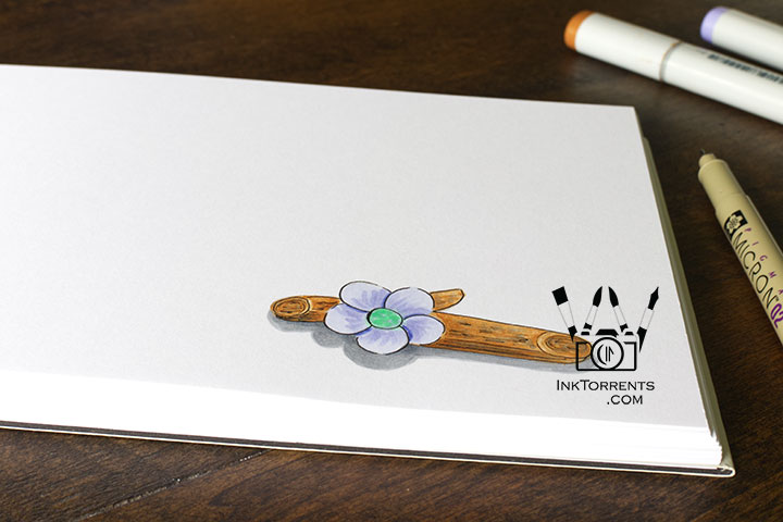
Last weekend, I drew this little flower in one of my handmade books.  The colors blended seamlessly, and I was also able to add additional detail strokes.  The paper kept the colors vibrant and bright.  I am really happy with this new smooth, thick paper I am using for my 100% handmade journals.  You can purchase them here in my shop.  They are wonderful for both writing and drawing.


I am very thankful for living close to these beautiful places that inspires me to draw and paint.  This gives you a little insight into my painting process.  I hope you can incorporate a few of these techniques in your own painting habits.  Most importantly though, just play with paint and paper.

Until next time,
-Soma


I am linking up with the linky parties on my Links page.  Please pay a visit to some of them.  Hosts of linky parties – please grab a photo of you choice for your party.  Thank you for hosting!


Leave a comment
 

error: Content is protected !!