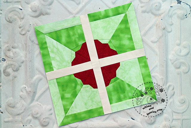
I am making a quilt for my kitties using one of my old patterns, Pinwheel Flower. I often get asked about how I choose colours for the blocks I make from my paper piecing patterns. For me they are illustrations done in fabric, so most of the time it is very akin to how I paint. I will try to show my selection process.
I use colours and prints together to create a certain style, mood, or even a season.

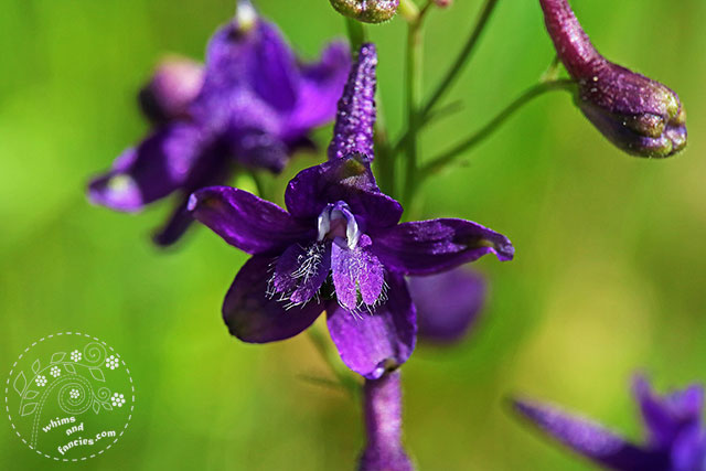
I took this photo of a little purple larkspur flower during a hike. I was looking for tiny little wild flowers for photography and my husband found this one for me. As this photo was my intial inspiration, I chose green for the quilt background.
Most of the time though, the background is the last fabric I select. No matter what the order is, I like the design of the block to stand out against the background colour and/or print. If I don’t get the right contrast, I change out the fabrics until I am satisfied.

I wanted the flowers to pop against the background without being too bright. It was also important to have a balanced ratio of cool and warm colours. From the very beginning, I was sure about the purple flower from my photo appearing in the quilt.

The other cool colour choice would be a shade of blue. After trying out quite a few mid- to dark blues, I settled on this teal. I adore that colour, but I don’t get to use it too often. I also have only a little bit of it left, just enough for my little kitty quilt.

I love yellow flowers. A vase full of yellow Chrysanthemums cheers me up immensely. Unfortunately, yellow was not dark enough to provide enough contrast against the green, so I picked the next best – a burnt orange.

For the last colour, I looked to our garden for inspiration. We have two wildflower plants with the brightest shade of red flowers blooming in our garden. The whole plant looks like it is bursting into red fireworks. That became the red flower in my quilt.
The idea for this block came from a combination of seeing a flower through my atelier window and a pinwheel block. For sashing, it was going to be either white or cream fabric to represent the window frame. Since the green I chose was a warmer green, I used a yellowish-cream for the sashing.

Once I finish selecting the colours, I start on the prints. I think about what the quilt is supposed to represent. That helps me decide on the style as well as giving the quilt a sense of coherence while I choose the prints.
When I show you the finished quilt, you will see why I used blender fabrics for this one.
-Soma
I am linking up with the linky parties on my Events And Links page. Please pay a visit to some of them.
Leave a comment


